Ripple

Ripple

Blocks

Blocks

Reeded Glass

Reeded Glass

Shutters

Shutters

Pixel Scan

Pixel Scan

Distortion

Distortion

Burn

Burn

Error

Error

Crack

Crack

Scan

Scan

Ripple

Ripple

Blocks

Blocks

Reeded Glass

Reeded Glass

Shutters

Shutters

Pixel Scan

Pixel Scan

Distortion

Distortion

Burn

Burn

Error

Error

Crack

Crack

Scan

Scan

Ripple

Ripple Icon
Ripple Icon
Ripple Icon

Ripple brings a unique distorted perspective to your work. It simulates the surface tension of liquid, making the image present a radial ripple effect, allowing the audience to see the image transition from surging to calm. Ripple is especially suitable for showcasing works with an artistic atmosphere, helping you create a stylish, mysterious, and dynamic ambiance that makes your work captivating.

Copy Component

Property Control

Wave: Count (Number: 0 - 100)

The number of waves. Larger values will create denser ripples.

Wave: Spacing (Number: 0 - 100)

The spacing between waves. Larger values will make the waves further apart and the curves smoother.

Wave: Height (Number: 0 - 100)

The height of the waves. Larger values will distort the image within the waves more.

Advance: Move (Boolean: Yes/No)

Movement effect. When enabled, the distortion will be accompanied by a move effect as the animation progresses.

Advance: Speed (Number: 0 - 1)

The speed of the movement. Larger values will make the movement faster.

Advance: Keep Distorting (Boolean: Yes/No)

Keep Distorting. When enabled, the distorting effect will no longer fade as the animation progresses.

Advance: Reverse (Boolean: Yes/No)

Reverse the movement. When enabled, the movement direction will be reversed, from diffuse to contracted.

Advance: Fade In (Boolean: Yes/No)

Enables or disables the fade-in effect. When enabled, the initial state can be set via “Advance: Opacity” and “Advance: Scale”.

Advance: Opacity (Number: 0 - 1)

The opacity of the appearance animation. When set to 0, there will be a short fade-in effect.

Advance: Scale (Number: 0 - 10)

The scaling factor of the animation.

The properties below will be available when you use the Nest component.

Animation Start (EventHandler: onAnimationStart)

Triggers the event when the animation starts.

Animation End (EventHandler: onAnimationEnd)

Triggered when the animation ends.

Video End (EventHandler: onVideoEnd)

Triggered when the video playback ends, this event will not be triggered when "Loop" is "Yes".

Media Loaded (EventHandler: onMediaload)

Triggered when the media is loaded.

Distortion
Component
Media

Image

Video

Image

Image

Size

Fill

Wave

5, 4, 10

Advance

Move

Animate

Appear

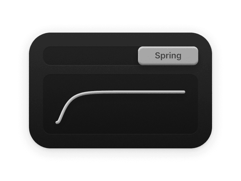
Transition

Spring

Variant 1

Variant 2

Distortion
Component
Media

Image

Video

Image

Image

Size

Fill

Wave

5, 4, 10

Advance

Move

Animate

Appear

Transition

Spring

Variant 1

Variant 2

Distortion
Component
Media

Image

Video

Image

Image

Size

Fill

Wave

5, 4, 10

Advance

Move

Animate

Appear

Transition

Spring

Variant 1

Variant 2

Features

Use your favorite
Image & Video.

Trigger effects with Scroll Animation.

Interactive experience with Scroll Transform.

Interactive experience
with Scroll Transform.

Media changes with Color Themes.

Compatible with
Framer Transition Controls.

Maintain Effects
after the transition.

Next

Variant 1

Variant 2

Video

by

Cássio Nunes

Variant 1

Variant 2

Video

by

Cássio Nunes

Reveals cool WebGL Effects Components for Framer.