Pixel Scan

Pixel brings a unique digital deconstruction and pixelated visual experience to your work, creating a stunning progressive presentation process. Viewers will be captivated by the appearance of each pixel, witnessing the reshaping of media content. Whether used for digital artwork or to highlight technological themes, the Pixel effect adds a distinctive modern feel and creative flair to your work. By adjusting the number of pixels, degree of randomness, and direction of appearance, you can create visual styles ranging from delicate to bold, making your work stand out.

Copy Component

Component Copied

Property Controls

Pixel Scan
Component
Media

Image

Video

Image

Image

Size

Fill

Pixel
Radomness
Direction
Scale Effect

Yes

No

Color

Color

Animate

Appear

Transition

Spring

Pixel Scan
Component
Media

Image

Video

Image

Image

Size

Fill

Pixel
Radomness
Direction
Scale Effect

Yes

No

Color

Color

Animate

Appear

Transition

Spring

Pixel Scan
Component
Media

Image

Video

Image

Image

Size

Fill

Pixel
Radomness
Direction
Scale Effect

Yes

No

Color

Color

Animate

Appear

Transition

Spring

Features

Image & Video

The component supports images or videos as input media. It is compatible with Framer's built-in media modifiers, allowing adjustments to input media.

Scroll Animation

The component can monitor viewport status and trigger preset animations when media elements enter the visible area. The trigger threshold is customizable.

Scroll Transform

The component can dynamically adjust animation states based on page scroll progress. The animation range can be controlled through parameters.

Light/Dark Theme Media

The component can dynamically switch media resources based on the current theme (light/dark). It supports preset different media content for different themes.

Custom Transition

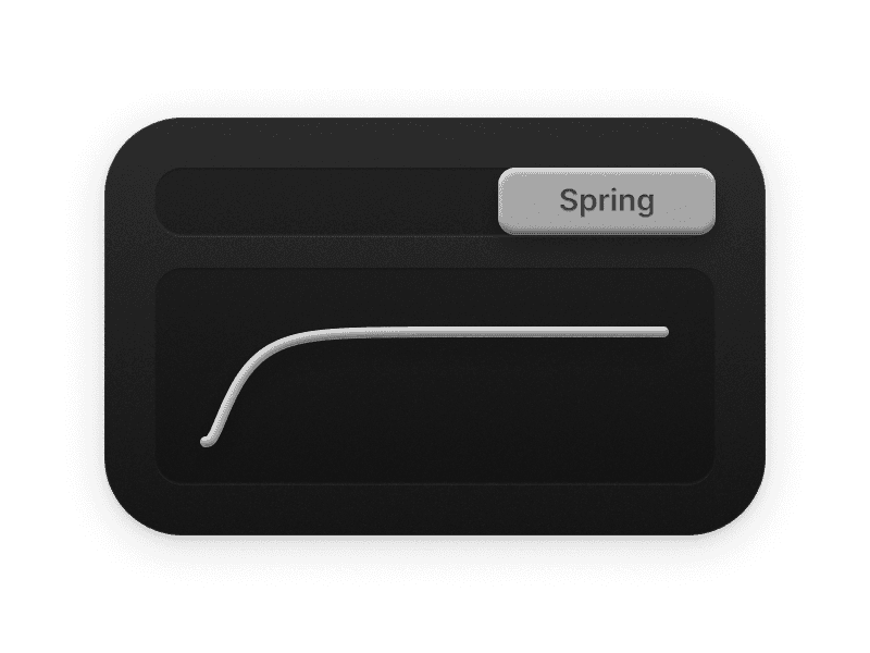
The component integrates Framer's transition controller. It supports customization of easing functions and spring parameters.

Tips

By enabling the Scale Effect in dark images, the pixels will have the effect of flickering at the edges.

Property Specification

Pixel (1 - 500)

Controls the number and size of pixels. Higher values produce more, smaller pixels, creating a more refined pixelated effect. Note: Using excessively high values may affect performance.

Randomness (0 - 1)

Adjusts the degree of randomness in pixel appearance. Higher values cause pixels to appear in more random locations, increasing visual complexity and irregularity.

Brightness (0 - 10)

Sets the peak brightness of pixels. Controls the maximum brightness that pixels can reach during the animation, affecting the overall visual effect's luminosity and contrast.

Direction (T/R/B/L/TL/TR/BL/BR)

Specifies the direction of pixel appearance. Options include Top (T), Right (R), Bottom (B), Left (L), Top-Left (TL), Top-Right (TR), Bottom-Left (BL), Bottom-Right (BR).

Scale Effect (Yes/No)

Enables or disables the scaling effect. When enabled, the entire media is scaled after each pixel animation is completed. Note: Scaling is based on the original aspect ratio of the media; if the container aspect ratio differs from the media aspect ratio, it may result in image cropping.

Scale Value (0 - 2)

Controls the media scaling factor when Scale Effect is enabled.

Explore the next effector.

Distortion

Distortions Effect Cover

Reveals cool WebGL Effects Components for Framer.